THE NEW ZECHA BRANDING
Welcome to the new face of ZECHA! Our refreshed branding marks an exciting chapter in our journey, reflecting our commitment to precision and innovation. On this page, we’ll delve into the various elements of our new branding and how this evolution continues the legacy of excellence in our tooling. Discover how our new identity encapsulates the ZECHA spirit and our dedication to creating extraordinary products that set industry standards. Join us as we celebrate this milestone and continue to push the boundaries of what’s possible in precision tooling.
THE NEW LOGO
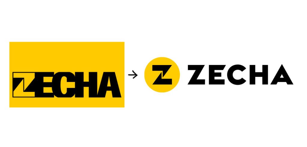
Our new logo features a perfect circle, symbolizing the flawless concentricity of our tools – the cornerstone of precision. While keeping the original colors, we’ve subtly refined the iconic “Z” that has remained a focal point of our logo over the years.


VISUAL STYLE
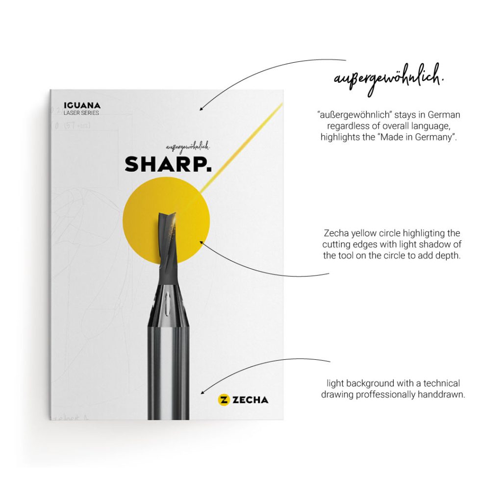
Our visual style leverages the circle from our new logo to emphasize the cutting edges of our tools, showcasing the meticulous precision that defines ZECHA products. This circle not only highlights our commitment to accuracy but also serves as a visual anchor, drawing attention to the crucial elements that ensure superior performance.
Incorporating hand-drawn technical drawings into the background adds a unique, personal touch to our branding. These illustrations represent the real people behind ZECHA, who infuse their passion and extensive experience into every tool we produce. This blend of precise geometry and human artistry underscores our dedication to creating tools that are not only technically superior but also crafted with care and expertise. This visual approach reflects our belief that exceptional tools result from the perfect harmony of cutting-edge technology and human ingenuity.
AUßERGEWÖHNLICH
At ZECHA, we embrace the German word “außergewöhnlich,” which translates to “extraordinary” in English. This term perfectly encapsulates our dedication to delivering exceptional products and services. We use “außergewöhnlich” to convey the unparalleled quality and innovation that defines ZECHA tools.
Regardless of the language in our marketing materials, “außergewöhnlich” will always remain in German. This decision honors our German roots and underscores the heritage of precision engineering and craftsmanship that is the backbone of our brand. By maintaining this unique element, we highlight the consistency and excellence that our customers can expect from ZECHA, no matter where they are in the world.

EVOLUTION OF THE ZECHA LOGO
Below, you’ll find a visual timeline showcasing the evolution of the ZECHA logo. Starting with the original ‘EZ’ logo created by our founder Erwin Zecha, each iteration represents a significant milestone in our journey of innovation and growth. From the classic ‘EZ’ emblem to today’s modern, precise circle design, our logo reflects the enduring values and cutting-edge advancements that define ZECHA. Explore how our brand has evolved while staying true to the heritage of precision and excellence that started it all.
